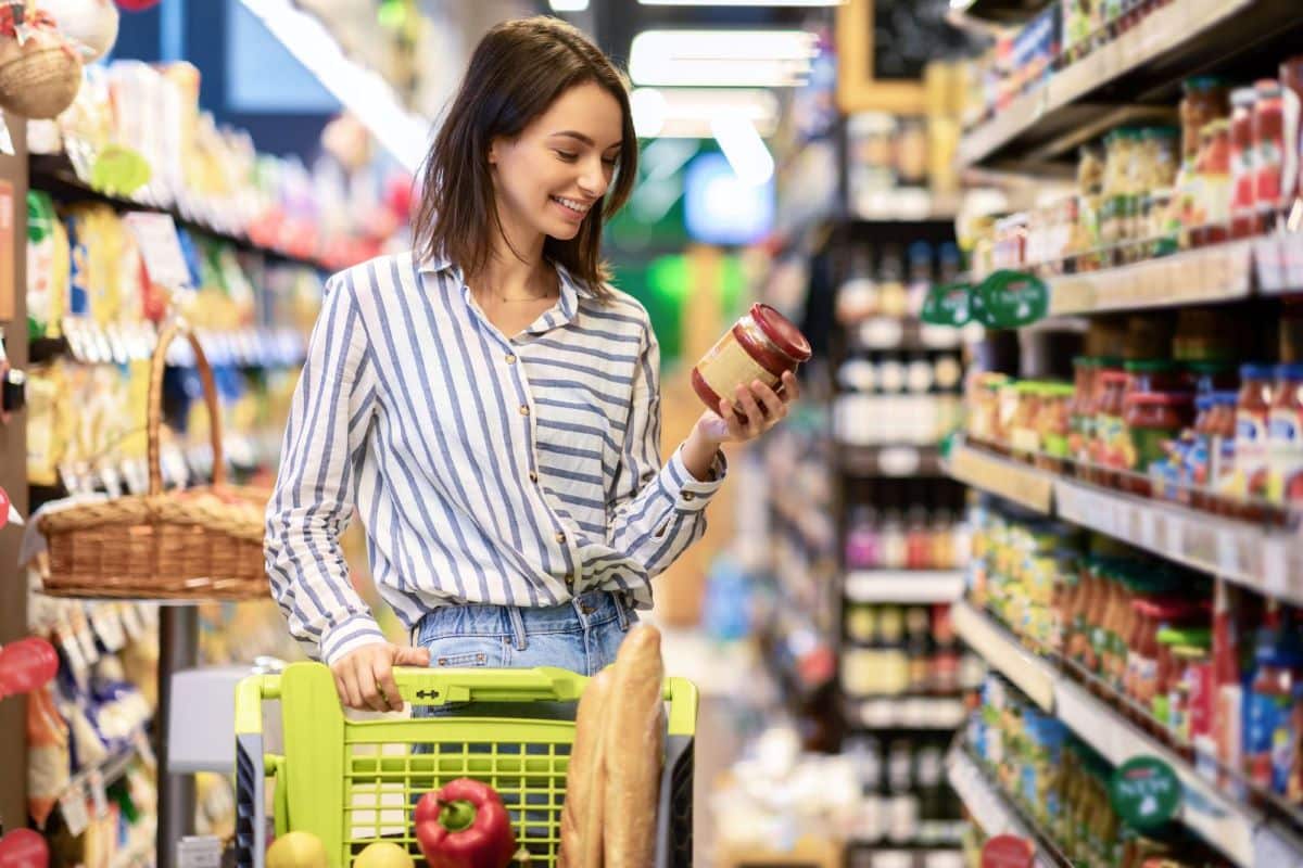
Ever felt like your quick grocery run always turns into a cart full of items you didn’t plan to buy? Discover how grocery stores are designed to make you spend more and find out if you’re being duped.
1. The Entrance Ambiance

From the moment you step in, grocery stores use inviting displays and bright lighting to create a welcoming atmosphere. This positive first impression puts you in a good mood and encourages you to shop longer.
2. Fresh Produce at the Front

Fresh fruits and vegetables are placed near the entrance to signal freshness and health. Their vibrant colors and pleasant scents set the tone for the rest of your shopping experience, making you more likely to buy more.
3. The Bakery’s Seductive Smell

Bakeries are strategically placed near the front or middle of the store, filling the air with the irresistible smell of fresh bread and pastries. This aroma can trigger hunger and prompt impulse buys.
4. Dairy at the Back

Essential items like milk, eggs, and cheese are located at the back of the store. This forces you to walk through multiple aisles, increasing the chances of picking up additional items along the way.
5. Aisle Arrangement

Aisles are designed to encourage a specific flow of traffic, usually from right to left, which matches the natural tendency of most right-handed people. This setup maximizes exposure to more products.
6. End Cap Displays

End caps, or the displays at the end of aisles, feature high-margin or promotional items. These products are placed here because they catch your eye, leading to spontaneous purchases.
7. Eye-Level Products

Products placed at eye level are typically more expensive or higher-margin items. This prime real estate ensures that you see them first, making you more likely to add them to your cart.
8. Kid-Friendly Zones

Sugary cereals and snacks are often placed at a lower level where children can see and reach them. This strategy exploits “pester power,” encouraging kids to beg their parents for these items.
9. Music and Lighting

Soft, slow music and warm lighting create a relaxing shopping environment. This ambiance slows you down, encouraging you to spend more time and, consequently, more money.
10. Sample Stations

Free samples aren’t just about generosity—they’re a calculated move to entice you to buy products you might not otherwise consider. Sampling disrupts your shopping flow, making you more likely to linger and purchase.
11. Narrow Aisles

Narrow aisles make it difficult to turn around, encouraging you to continue down the aisle and potentially add more items to your cart. They also create a sense of urgency, prompting quicker decisions.
12. The Checkout Gauntlet

The checkout area is lined with impulse buys like candy, magazines, and small gadgets. As you wait, you’re tempted to grab these items, adding last-minute purchases to your bill.
13. Strategic Sales and Promotions

Stores place sales items in prominent locations to catch your attention. However, these deals often lead you to buy things you don’t need, increasing overall spending.
14. Loyalty Programs

Loyalty programs track your shopping habits and offer targeted discounts, encouraging you to buy more. The promise of rewards keeps you coming back and spending more.
15. Cross-Merchandising

Placing related items together, like pasta and pasta sauce, prompts you to buy both. This strategic placement makes it easy to add complementary items to your cart without much thought.
16. Limited-Time Offers

Limited-time offers create a sense of urgency, making you feel like you need to buy now or miss out. This tactic can lead to hasty, and often unnecessary, purchases.
17. Bulk Buy Temptations

Bulk items are positioned to suggest savings, but they can lead to over-purchasing. You might buy more than you need because the larger quantity seems like a better deal.
18. Cart Size

Larger shopping carts encourage you to buy more. The more space you have, the more likely you are to fill it, leading to increased spending.
19. Special Lighting for Products

Special lighting is used to make products look more appealing. For example, meat is often displayed under red-tinted lights to make it look fresher and more enticing.
20. Seasonal Displays

Seasonal displays at the entrance and throughout the store keep you thinking about holidays and special occasions, prompting you to buy themed products you might not need otherwise.
21. The Exit Path

Even as you leave, stores place last-minute items like discounted products and essentials near the exit. This setup captures any final impulse purchases before you leave.
Conclusion: Shop Smarter, Not Harder

Next time you’re grocery shopping, be aware of these tactics. Recognizing these strategies can help you make more mindful choices and stick to your shopping list, saving you money and avoiding unnecessary purchases.
The post Grocery Store Secrets: How Layout and Design Make You Spend More first appeared on Mama Say What?!
Featured Image Credit: Shutterstock / Prostock-studio.
For transparency, this content was partly developed with AI assistance and carefully curated by an experienced editor to be informative and ensure accuracy.


